


Business intelligence tools are used to visualize data and generate meaningful insights from it. Choosing the right BI tool in this evolving data analytics space is one of the most difficult decisions to make. BI tools have emerged as an essential solution that helps businesses to effectively manage, clean, and transform data.
In this article, we will discuss the three popular BI tools in the market Sprinkle Data, Qlik Sense, and Tableau. Along with this, we will compare some key features of these BI tools to help you choose the right one according to your needs.
What is Tableau?

Tableau is a powerful business intelligence tool with advanced analytics features that has changed how companies interpret data. With its user-friendly interface users can create dashboards in seconds with a large dataset or just a few rows of information.
Also, check Power BI vs Tableau here
What is Qliksense?
QlikSense is a powerful business intelligence tool developed by Qlik, a leading software company known for its data visualization and analytics products. It allows users to efficiently create interactive dashboards by combining data from multiple data sources, helping them gain valuable insights into their business operations.
The emergence of QlikSense can be attributed to the growing demand for self-service analytics tools that empower non-technical users to explore and understand their data without relying on IT teams.
What is Sprinkle Data?

Sprinkle Data is a self-service business intelligence tool that empowers users to explore and analyze data in seconds. With its user-friendly interface and drag-and-drop capabilities, Sprinkle Data enables users to build customized reports and data visualizations.
Tableau Vs QlikSense Vs Sprinkle Data: Key Differences

1. Data importing options
Tableau
When it comes to importing data, Tableau offers a variety of options to connect to different data sources. Users can import data from Excel spreadsheets, SQL databases, cloud services like Google Analytics or Salesforce, and more. The supported data importing options in Tableau are mentioned below:

Qlik Sense
Qlik Sense offers a range of options for importing data from different sources. Users can connect to Excel files, SQL databases, cloud services like Amazon Redshift or Snowflake, and more. Qlik Sense also provides a feature called Data Load Editor that allows users to transform and clean data before loading it into the tool. Data sources supported in Qlik sense are mentioned below:

Sprinkle Data
Sprinkle Data is a self-serve BI platform that has quickly gained popularity for its ease of use and advanced features. When it comes to importing data, Sprinkle Data stands out for its seamless integration with various data warehouses such as Amazon Redshift, MySQL, Google Bigquery, etc. Some of the data sources supported by Sprinkle Data are mentioned below:

2. Data Preparation and transformation capabilities
When it comes to data preparation and transformation capabilities, Tableau, Qlik Sense, and Sprinkle Data are three popular tools that offer powerful features for handling data effectively.
Tableau
Tableau Prep Builder equips users with the power to easily clean, transform, and organize their data before visualizing it in Tableau Desktop. Tableau Prep Builder provides a visual interface that allows users to drag-and-drop operations to clean and reshape their data without the need for coding or complex queries. Users can also combine multiple datasets, split columns, pivot tables, and remove duplicates with ease.

Qlik Sense:
Qlik Sense enables users to explore and transform large datasets quickly using different techniques in the data load editor. QlikSense is known for its associative data model that allows users to explore relationships between different data points seamlessly.
It also offers a user-friendly interface for cleaning and transforming data through drag-and-drop actions. Users can also create custom expressions using Qlik's proprietary scripting language to manipulate data as needed.

Sprinkle Data:
Sprinkle Data has gained popularity for its advanced data preparation and transformation capabilities. It offers a wide range of features for cleaning, enriching, and transforming raw data into actionable insights.
The platform's unique modeling layer helps to transform, clean, and join data across different data models with abilities like the creation of calculated fields, custom formulas, hierarchies, changing date formats, and more. Along with this, users can also write code in SQL and Python to transform raw data.
3. Data Visualizations: chart types supported
Tableau, QlikSense, and Sprinkle Data offer unique features and capabilities for creating visually appealing charts and graphs.
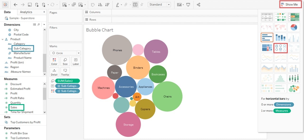
Tableau
Tableau is a well-known data visualization tool that is popular among data analysts and business users. It offers a wide range of chart types, including bar charts, line charts, whisker plots, box plots, treemaps, scatter plots, bubble charts, Gantt charts, heat maps, and more. Users can easily create interactive dashboards and reports to explore their data in depth by using methods such as sorting, filtering, and grouping.

Qlik Sense
QlikSense primarily focuses on self-service analytics beneficial for users with less technical expertise. It supports a variety of chart types such as bar charts, pie charts, combo charts, scatter charts, line charts, radar charts, grid charts, gauge charts, etc. QlikSense also allows users to build custom visualizations using its drag-and-drop interface.

For more information on each chart type, click here
Sprinkle Data
Sprinkle Data offers support for various chart types like line charts, bar charts, column charts, area charts, combo charts, scatter plots, pie charts, bubble charts, stat charts, funnel charts, point maps, and heat maps, and also table type visualizations like pivot table are supported.
Along with this, the platform has plenty of options to customize reports according to requirements without writing a line of code.

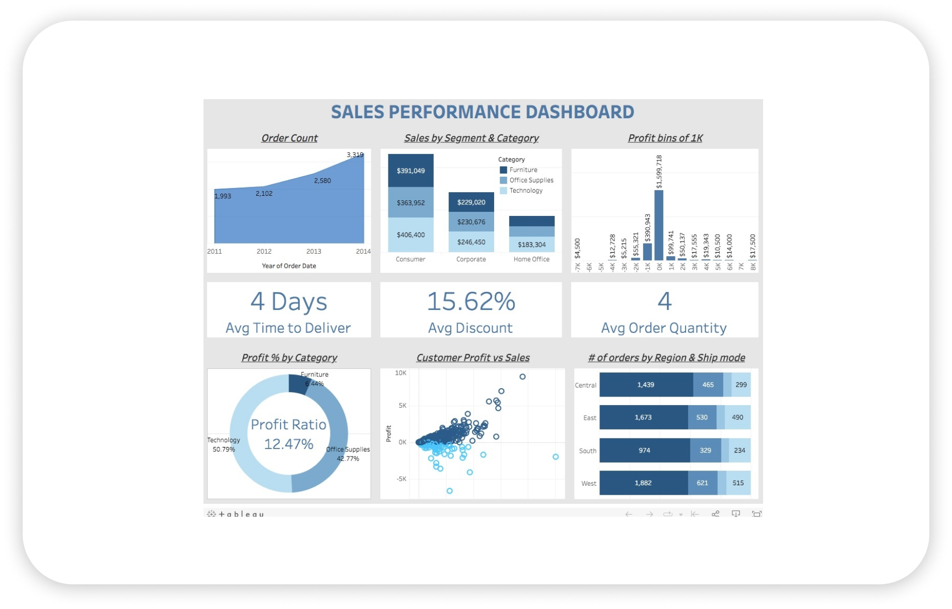
4. Dashboard Features
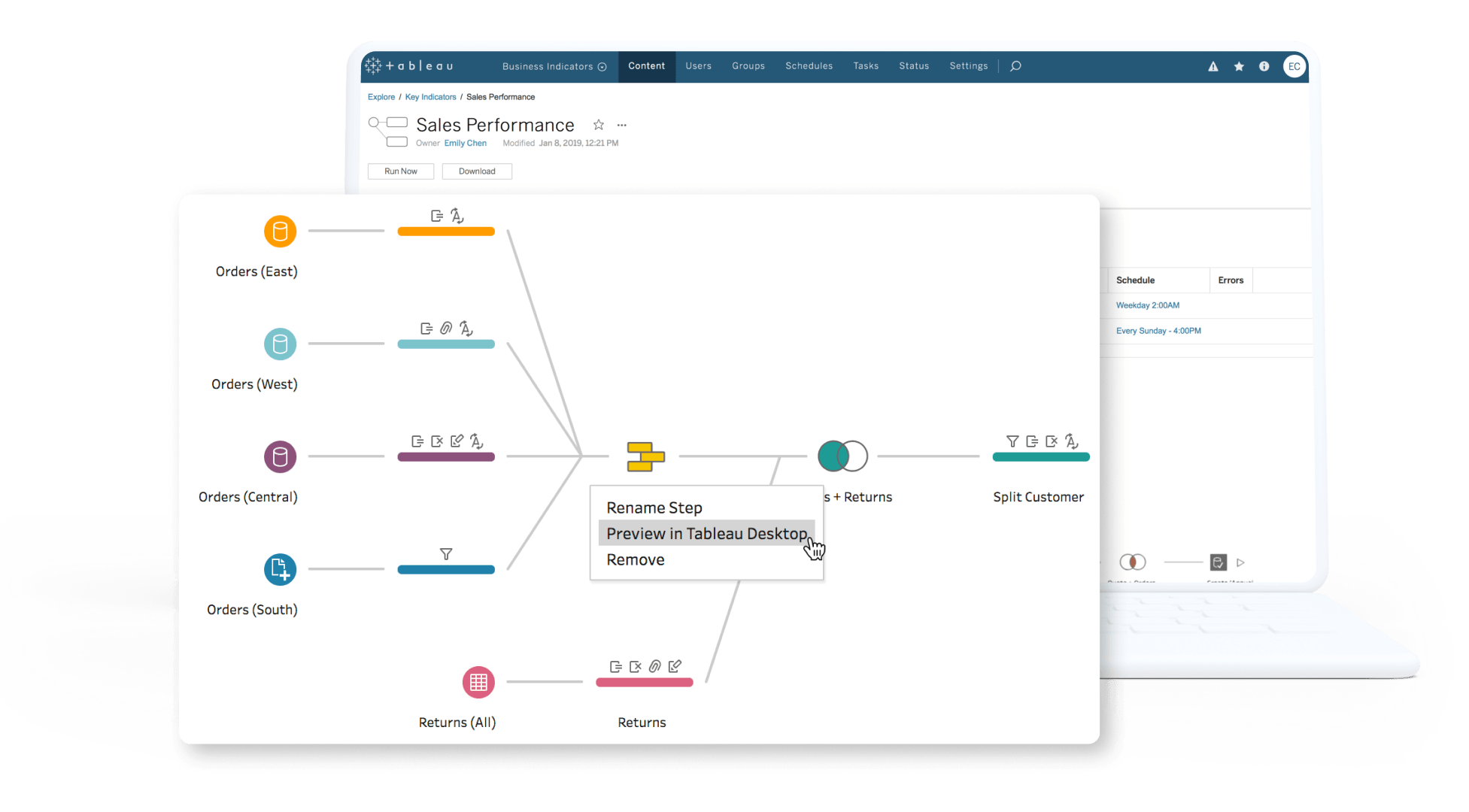
Tableau
In Tableau users can easily drag and drop data fields onto a canvas to create visually appealing dashboards with ease. Tableau also offers advanced filtering options, drill-down capabilities, animations, and tooltips to enhance the interactivity of dashboards. Some of the standout features in Tableau dashboards are
- Data Stories that help to summarize key insights.
- Embedded images to improve the user experience.
- Tableau accelerators help to quickly get you started in the data analysis journey using custom-made dashboard templates.
- The Ask data feature helps to get answers in the form of data visualizations.
Tableau allows users to create compelling narratives by combining multiple visualizations into a cohesive story. It also offers annotations, text boxes, images, and web content integration to further enhance the storytelling experience.

Qlik Sense
QlikSense's unique feature called Data Storytelling enables users to create dynamic stories by incorporating visuals such as charts, tables, images, and text within a single canvas. Users can easily switch between exploring data interactively and presenting insights in a structured format.
Some of the features in Qlik Sense dashboards are:
- QlikSense also offers advanced collaboration capabilities with its Insight Advisor feature that suggests relevant visualizations based on the user's selections.
- QlikSense provides support for natural language search queries which makes it easier for users to ask questions and get instant answers from their data.

Sprinkle Data
Dashboards in Sprinkle Data are easy to create and maintain. With just a few clicks you can add multiple reports to the dashboard. Some of the features present in the dashboard include:
- The click behavior helps users to customize the interactivity of the dashboards by providing the users with drill and breakout, linked insights, and cross-filtering options.
- The data alerts feature helps to get alerts via email when some predefined conditions are met.
- The date drill option in the dashboard helps to understand data at the same date formats at different granularity.
- The embed link option in the dashboard is useful for performing embedded analytics.

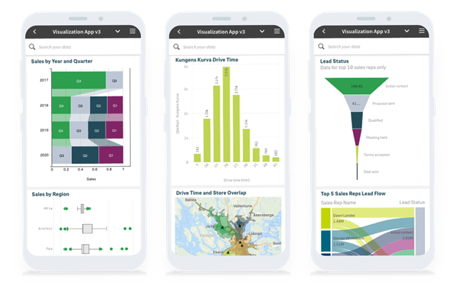
5. Mobile Accessibility
With the rise of mobile devices, many businesses are looking for data visualization tools that are accessible on smartphones and tablets.
Tableau
Tableau also offers a dedicated mobile app that provides a seamless experience for viewing and interacting with data.

Qlik Sense
QlikSense also has a mobile app that allows users to access their dashboards and reports from anywhere. However, some users have reported limitations in terms of customization options and performance when using QlikSense on mobile devices.

Sprinkle Data
Sprinkle Data also offers a responsive web design that ensures dashboards look great on any device, including smartphones and tablets.

6. Pricing
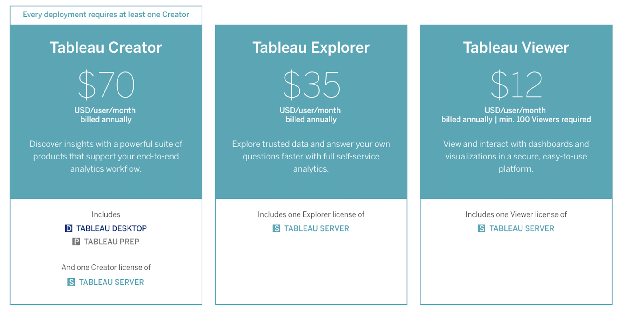
Tableau:
Tableau offers a range of products for different requirements, including Tableau Desktop, Tableau Server, and Tableau Online.
In terms of pricing, Tableau offers a variety of subscription plans based on the number of users and features needed. The cost can range from $70 per month for a single user to over $1,000 per year for multiple users with advanced features.

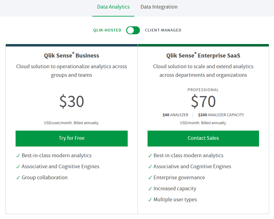
Qlik Sense:
Qlik Sense offers different subscription plans based on the number of users and features required. Pricing starts at around $30 per user per month for a basic plan and can go up to $70 per user per month for more advanced features.

Sprinkle Data
Sprinkle Data offers a simple pricing model that makes it an attractive option for small to medium-sized businesses looking for an affordable yet powerful data visualization tool.

Conclusion
When comparing Tableau, QlikSense, and Sprinkle Data, it is clear that each platform has its unique features. Tableau is known for its user-friendly interface and powerful visualization capabilities, QlikSense offers robust data integration and exploration features, allowing users to uncover insights from complex datasets. Sprinkle Data stands out for its low-code self-service analytics platform, which can automate the data analysis process and provide real-time or near-real-time insights.
Click here to get started with Sprinkle Data
Frequently Asked Questions FAQs- Tableau Vs Qlik sense vs Sprinkle data
Is Tableau better than Qlik Sense?
Tableau is known for its user-friendly interface and ease of use, and Qlik Sense is praised for its associative data model and powerful data analysis capabilities.
What is the difference between Qlik Sense and Qlik?
Qlik Sense is a self-service analytics tool that allows users to create interactive visualizations and dashboards, while Qlik (formerly known as QlikView) is an older product that offers more advanced features such as complex data modeling and scripting capabilities.
Is Tableau becoming obsolete?
While there may be newer tools entering the market, Tableau remains a popular choice among organizations for its robust features and user-friendly interface.
What are the advantages of Tableau over QlikView?
Some advantages of Tableau over QlikView include its intuitive drag-and-drop interface, extensive customization options for visualizations, seamless integration with various data sources, and strong community support.
What is the disadvantage of Tableau?
One disadvantage of Tableau is its high cost compared to other similar tools in the market. Some users find that Tableau's learning curve can be steep for beginners who are not familiar with data visualization concepts.
How is Qlik different from Tableau?
Qlik differs from Tableau in its associative data model approach which allows users to explore relationships within their data dynamically. This makes it easier for users to discover insights that they may not have considered initially.
Why is Tableau so expensive?
Tableau's pricing can be considered high due to its robust features, continuous innovation, strong customer support, and brand reputation in the industry.
Why Tableau is better than other data analytics tools?
Tableau stands out from other tools due to its user-friendly interface, extensive customization options for visualizations, seamless integration with various data sources, predictive modeling and predictive analytics capabilities, strong community support through forums and user groups, and regular updates introducing new features based on user feedback.
Is Tableau good for big data?
Yes, Tableau is well-suited for handling big data as it can connect with large datasets stored in databases or cloud platforms like Hadoop or Amazon Redshift. Its robust processing power allows users to analyze massive amounts of data efficiently.
What are the advantages of QlikView over Tableau?
Some advantages of QlikView over Tableau include its powerful associative engine that enables dynamic data exploration, advanced scripting capabilities allowing complex calculations and transformations, and flexibility in building custom applications tailored to specific business needs.


