


Data visualization is a powerful technique that allows us to make sense of complex information and communicate it effectively. In today's data-driven world, being able to create compelling visual representations of data is essential for businesses, researchers, and decision-makers.
In this blog post, we will explore the importance of data visualization, different types of visualizations, and best practices for creating meaningful and impactful visuals.
Join us on this journey as we delve into the world of data visualization and discover how it can transform the way we understand and interpret data.
What is Finance Data Visualization?

Finance data visualization is a method of presenting financial statements in a visual format, such as charts, graphs, and dashboards. This allows individuals to easily interpret complex information and make informed decisions based on the insights gained from the financial reporting.
Finance data visualization techniques can help improve communication within an organization. Instead of presenting spreadsheets or reports filled with numbers, financial professionals can present complex financial information engagingly. This can be particularly useful when presenting financial insights to stakeholders who may not have a background in finance.
Financial data visualization can aid in decision-making processes. By presenting data in a visual format, individuals can better understand the implications of different scenarios and make more informed choices about investments, budgeting, and other financial matters.
How to Analyze Financial Data?
Whether you are an individual looking to track your finances or a business owner wanting to analyze a company's financial data, visualizing it can provide valuable insights that may not be immediately apparent in raw numbers.
Here are some ways how to effectively visualize financial institutions' data:
- Choose the right type of chart: The chart type you use can greatly impact how easily the data can be understood. Common chart types used for financial data include line graphs, bar graphs, pie charts, and scatter plots.
- Use color strategically: Color can help differentiate between different categories or highlight important trends. However, using too many colors can make the chart cluttered and difficult to read.
- Provide context with labels and annotations: Make sure to label your axes adding annotations can also help highlight key points or outliers.
- Use interactive elements: Interactive charts allow users to explore the data further by hovering over data points or filtering out specific categories.
- Consider using trendlines: Trendlines can help identify patterns in the data and make it easier to spot trends over time.
- Utilize dashboards: Dashboards are a great way to consolidate multiple charts and visualizations into one easy-to-read format. This allows users to quickly compare different metrics and get a comprehensive overview of the data.
- Incorporate historical comparisons: Comparing current financial data to historical trends can provide valuable context and insight into long-term performance.
- Utilize heatmaps for large datasets: Heatmaps are useful for displaying large volumes of data in a visually appealing way. They use color intensity to represent values, making it easy to spot patterns at a glance.
- Create ratio analysis visuals: Ratios such as profit margins, return on investment, and debt-to-equity ratios can be effectively visualized using bar graphs or pie charts to show how these metrics change over time or across different segments.
Types of visualizations to use while visualizing financial data
Visualizing financial data is an essential aspect of analyzing and interpreting complex financial information. Many types of visualization techniques can be used to represent financial data in a meaningful way.
In this section, we will explore 10 data visualization types and when they are most commonly used while visualizing complex financial data.
1. Line charts:

Line charts are a type of data visualization that displays information as a series of points connected by straight lines. They are commonly used in financial visualizations to show the trend of a particular variable over time.
Line charts are often used in finance to track stock prices, exchange rates, interest rates, and other economic indicators.
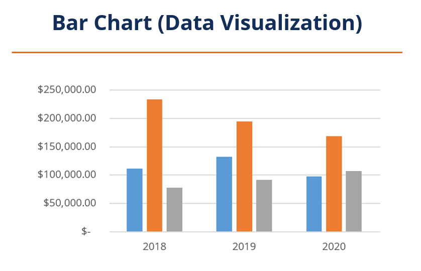
2. Bar charts:

Bar charts are a common type of chart used in financial visualization to display data in a visual and easy-to-understand format. They are made up of rectangular bars that represent the values being compared, with the length or height of each bar corresponding to the value it represents.
Bar charts can be used to visualize various types of financial data, such as stock prices, sales figures, expenses, profits, and market performance.
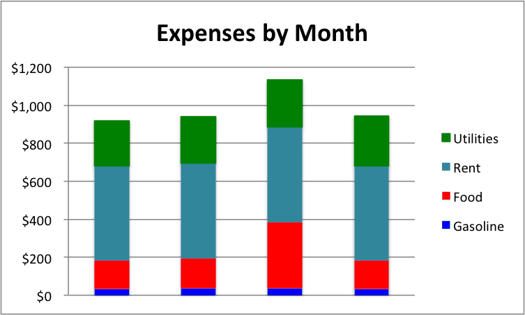
Stacked Bar Chart

Stacked bar charts can be particularly effective for displaying how different components contribute to a total value, while grouped bar charts allow for side-by-side comparisons between multiple categories.
3. Pie charts:

Pie charts are circular graphs that are divided into slices to represent the proportions of a whole. Each slice of the pie chart represents a different category or percentage, making it easy for viewers to quickly understand the data being presented.
Pie charts can also be used to show budget allocations, expenses, market share, and other important financial metrics. They are particularly useful when comparing multiple categories or segments within a dataset, as they make it easy to see relative sizes and proportions.
4. Scatter Plots:

A scatter chart plots individual data points on a graph, with one variable represented on the x-axis and the other variable represented on the y-axis. Each data point is then visualized as a dot or marker on the graph, which allows for easy identification of patterns, trends, and outliers.
One of the key benefits of using scatter charts in financial visualization is their ability to show correlations between different financial metrics.
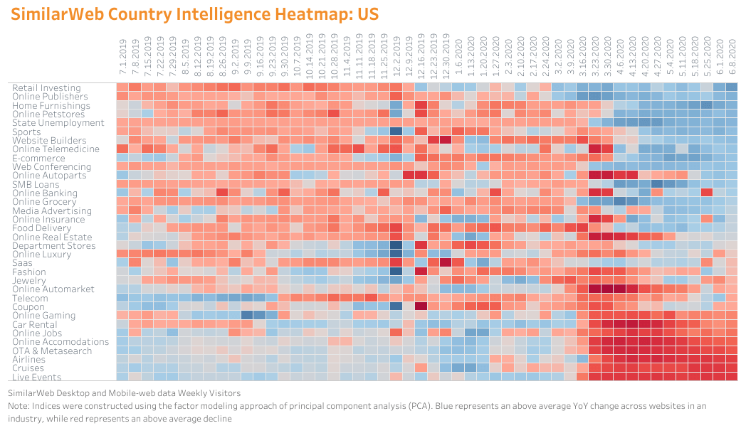
5. Heat maps:

Heatmaps are graphical representations of data where values in a matrix are represented as colors. The darker or lighter shades of color represent the magnitude of the values being displayed, making it easy to quickly identify patterns and trends within the data. Heatmaps are often used to visualize large datasets with multiple variables, allowing users to easily spot outliers or correlations between different data points.
In financial visualization, heatmaps are commonly used in a variety of ways:
- Portfolio analysis: Heatmaps can be used to visualize the performance of a portfolio by displaying the returns of different assets over time.
- Market analysis: Heatmaps can be used to track market movements by displaying changes in stock prices or indices over time.
- Sector analysis: Heatmaps can also be used to compare the performance of different sectors within an industry by displaying key metrics such as revenue growth or profit margins.
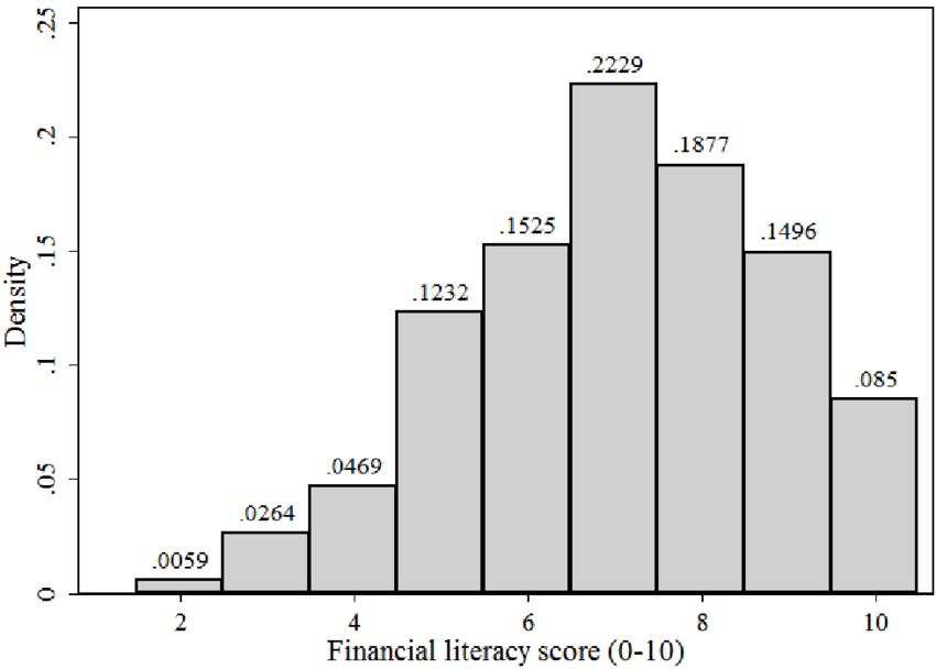
6. Histograms:

In a histogram, the data is divided into intervals or bins and then plotted as bars on a graph. The height of each bar represents the frequency or number of data points that fall within that interval. This allows viewers to quickly see how the data is distributed and if there are any outliers or unusual patterns present.
One common use of histograms in financial visualization is to analyze stock price movements.
7. Waterfall charts:

In a waterfall chart, each bar represents a different factor contributing to the total change. The bars are stacked on top of each other, with positive values extending upward from the baseline and negative values extending downward. This visual representation makes it easy to see which factors are driving increases or decreases in the total value being analyzed.
Some common uses of waterfall charts in financial visualization is for analyzing company profits, budgeting, and forecasting.
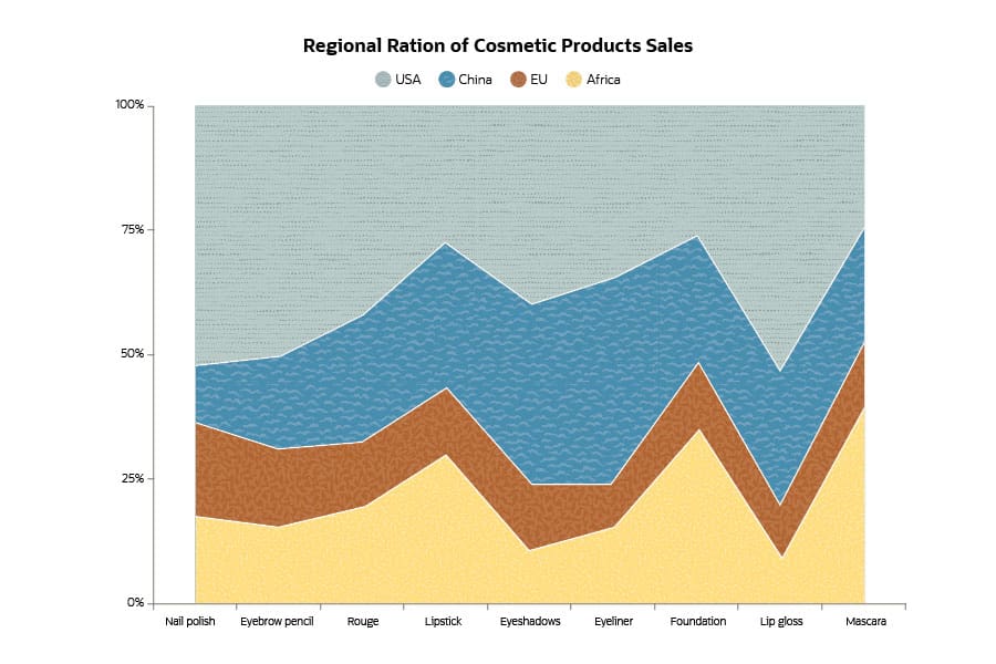
8. Area charts:
Area charts are a type of data visualization tool that is used to represent quantitative data over time or categories. They are similar to line charts in that they display trends and patterns, but area charts also fill in the space below the lines with colors or textures, creating a visual representation of the magnitude of values.
In financial visualization, area charts are commonly used to show how different components contribute to a total value over time.
9. Radar charts:
Radar charts, also known as spider or web charts, are a type of data visualization tool used to display multivariate data in a two-dimensional form. They consist of a series of equidistant spokes radiating out from a central point, with each spoke representing a different variable.
In financial visualization, radar charts are commonly used to compare the performance of multiple assets or portfolios across various metrics.
10. Sankey diagrams:

Sankey diagrams are a type of visual representation that shows the flow of energy, resources, or materials through a system. They are typically used to illustrate complex relationships between different elements in a system and can be highly effective in conveying information clearly and concisely.
In the world of finance, Sankey diagrams are often used to visualize the flow of money within an organization or financial system. This can include tracking how funds are allocated across different departments or projects, showing the distribution of profits and losses, or illustrating the movement of capital between various investment vehicles.
One common application of Sankey diagrams in financial visualization is in budgeting and financial planning. By using this type of diagram, companies can easily see where their money is being spent and identify areas where they may need to adjust their budgets or reallocate resources to monitor overall financial performance.
Sprinkle Data to the Rescue!
Among the many data visualization tools available in the market, Sprinkle Data stands out as one of the best options for users looking to effectively visualize their data. With its user-friendly interface, powerful features, and ability to generate insightful and interactive visualizations, Sprinkle Data is a valuable tool for anyone looking to gain deeper insights from their data.
Whether you are a small business owner looking to track key performance indicators or a data analyst working with large datasets, Sprinkle Data has the capabilities to meet your needs.
Investing in a high-quality data visualization tool like Sprinkle Data is worth the investment for anyone serious about making the most of their data. So why wait? Try out Sprinkle Data today and see how it can transform the way you work with your data.
Frequently Asked Questions FAQs - Importance of data visualization in finance
Why is data visualization important in finance?
Data visualization is important in finance because it helps financial professionals analyze large amounts of data quickly and efficiently. It allows them to identify trends, patterns, and outliers that may not be immediately apparent when looking at raw data.
What is the importance of data visualization?
The importance of data visualization lies in its ability to present information in a visual format that is easy to understand and interpret. By using charts, graphs, and other visual tools, complex data sets can be simplified and communicated effectively to stakeholders.
What is the purpose of data visualization for accountants?
For accountants, the purpose of data visualization is to simplify financial information and make it more accessible to non-financial professionals. By presenting financial data in a visual format, accountants can help management teams understand key performance indicators, track financial metrics over time, and make informed business decisions based on the insights provided by the visualization.
What are the 4 main visualization types?
The four main types of visualization are
- text-based visualizations (such as tables or lists),
- geometric visualizations (such as charts or graphs),
- hierarchical visualizations (such as tree maps or sunbursts), and
- relational visualizations (such as network diagrams or flowcharts).
How does visualization help in decision-making?
Visualization helps in decision-making by providing a clear overview of the data which makes it easier for users to identify relationships between variables or trends within the dataset. Visuals also aid in understanding complex information quickly which leads to faster decision-making processes.
How does data visualization affect decision-making?
Data visualization affects decision-making by improving the quality of decisions made by individuals or organizations. When data is presented visually, it becomes easier to identify patterns or outliers within datasets which can lead to better insights into potential opportunities or risks. This ultimately results in more effective decision-making.
How can data visualizations help a company make better business decisions?
Data visualizations help companies make better business decisions by enabling them to see trends and patterns within their data that may not be immediately obvious from looking at numbers alone. By presenting information visually through charts, graphs, or dashboards, companies can gain actionable insights that inform strategic planning and drive growth.
What is the value of data visualization in business?
The value of data visualization in business lies in its ability to turn complex datasets into actionable insights that drive strategic decision-making. By presenting information visually through charts or graphs, businesses can quickly identify patterns or trends within their data that inform their strategies for growth and success.
What is one of the biggest benefits of data visualizations?
One of the biggest benefits of data visualization is its ability to simplify complex information into an easily digestible format. By presenting data visually through charts or graphs, individuals can quickly grasp key insights without having to analyze raw numbers extensively. This leads to quicker decision-making processes based on accurate information presented clearly.


